
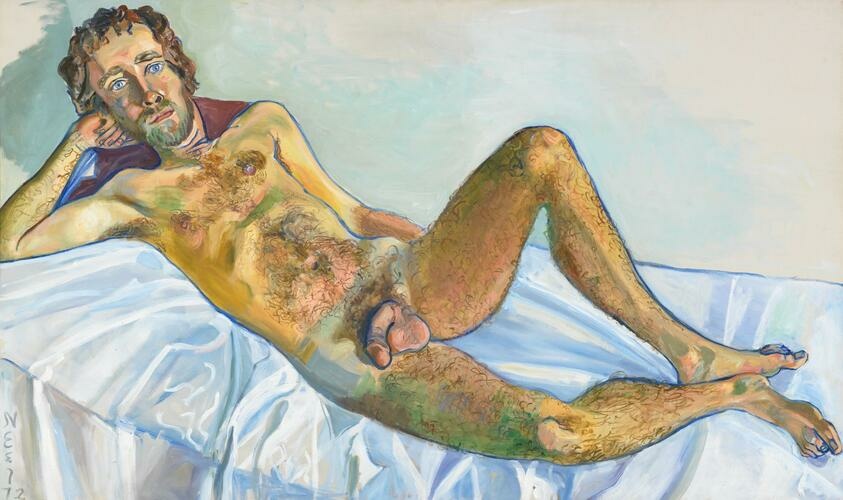
Have you ever seen a painting of a male nude described as “an egregious demonstration of manspreading”?
Me neither. Sure, if a dude is sitting on a train or a bus (preferably not nude, but it’s been known to happen), legs akimbo and junk exposed, ignoring the presence of anyone nearby as he takes up enough space for his donger and bits as humanly possible, manspreading is a perfectly apt word choice. But it was jarringly out of place on an object wall label for Alice Neel’s portrait of curator John Perreault, like a term from online screeds that floated its way from cyberspace onto the stuffy walls of the Metropolitan Museum of Art.
For a fuller context, the label for John Perreault reads:
“Perreault’s gangly, hairy limbs splay across the composition, and he boldly returns the viewer’s gaze; his piercing blue eyes signal complicity. The curator later claimed to have originated this pose, an egregious demonstration of manspreading that culminates in the full display of his genitals near the center of the canvas.”
Yeah. We can see them.
But, what makes male nudity “egregious”? Or how about “indecorous,” as another wall label reads? What’s the limit of tasteful male nudity? Or is it just all male nudity? To me, John Perreault is more playful than egregious, a coy reference to the female Odalisques that lounge their way through art history and a subversion of the traditional gender dynamics of portraiture with Neel as the woman painter of the nude male subject.
All of which begs the question: At what point does filtering historical artworks through the lens and verbiage of the outrage politics of the present actually overpower the artist’s intent?
This question nagged at me as I walked through the Metropolitan Museum of Art’s current exhibition Alice Neel: People Come First, curated by Kelly Baum and Randall Griffey, with Brinda Kumar. Though the show brought together an illuminating collection of Neel’s work (which other critics have covered at length), the curators, particularly through the wall texts and object labels, seemed so intent on painting Neel as a cutting-edge and near saint-like activist figure that they–or their intern–applied interpretations of Neel’s work, peppered with buzzwords and simplistic identity politics, that were at best overzealous and at worst just plain inaccurate.
It was, you could say, very woke. Too woke. Egregiously woke. However, I particularly loathe that term, which doesn’t seem to accurately describe the spreading obsession with ideological purity tests, arguments over semantics (woke-mantics), and dogmatically applied hierarchies of power, privilege, and identity. You know, the Oppression Olympics that occur every day on any number of cursed social media platforms. In grad school, Marion and I used to call this phenomenon “queerer than thou,” but since it’s no longer restricted to academia or queer circles, there should be a new phrase. Woke, at least to me, doesn’t cut it. Social justice warriors either. The perpetually outraged and traumatized? Maybe that’s it. But for now, I’ll stick with woke, even though I want to preface that I know it cheapens my argument somehow (the phrase “cancel culture” has a similar effect).
The first inkling I had about the problem–and the first time I sighed “Oh God…” before laughing my way through the rest of the exhibition–was the label for Isabetta, Neel’s portrait of her daughter. In the portrait, Isabetta, at six-years-old, stands nude. Hands on her hips and gazing directly at the viewer, she is unmarred by shame in the way children often are. But don’t be fooled! You should be concerned about this representation, according to the label:
“While the frank nudity of the young child disconcerted viewers then and continues to raise legitimate questions now around consent and children’s bodily autonomy, Neel considered the painting to be a touchstone.”
“Consent and children’s bodily autonomy”? Maybe if Isabetta wasn’t her daughter. What parent doesn’t at least have a couple nekkid pics of their young children?

I will note, however, that Neel and Isabetta’s relationship would sour and become estranged later in their lives. And perhaps because of this, some of Isabetta’s family feels a certain way about this portrait. In particular, Isabetta’s daughter Cristina Lancella proclaims in the documentary Alice Neel: “I think it’s disgusting. I would never have my children naked like that.” But, couldn’t this have been included in the label information rather than the mouthful of buzzwords that do nothing but sound accusatory?
In its pearl-clutching about the depiction of children, the label for Isabetta reminded me of the offended handwringing that occurred due to another Metropolitan Museum exhibition–2013’s Balthus: Cats and Girls–Paintings and Provocations. Laura Kipnis covers this incident in her wide-ranging essay “Transgression: An Elegy” in Liberties journal. She writes, “Creative umbrage flourished more flamboyantly in 2013, when the Metropolitan Museum staged an exhibition of the painter Balthus’ work and included Thérèse Dreaming, with its notorious flash of the pubescent Thérèse’s white panties smack in the center of the canvas. As to be expected, the Met attempted to accommodate offended sensibilities by posting a safety warning at the entrance to the exhibit advising that ‘some of the paintings in the exhibition may be disturbing to some visitors.’ Though the image of Therese is quite stylized, a petition called for the painting’s removal because of ‘the current news headlines highlighting a macro issue about the safety and wellbeing of women of all ages.’”
All of which reads like your average art-related controversy, which has been repeated ad nauseam the last several years. The troubling part, however, happened after this incident when the Museum overcorrected by over-explaining the painting through a new lengthy description on its website, shutting down all other interpretations of Thérèse Dreaming. Kipnis remarks, “No longer will a viewer’s eye be drawn to that glimpse of white panties and be unsettled, and wonder what to make of it. Goal to the offended, who have seized the license to be outrageous and impose their stories and desires on the polis, much as the transgressor classes once did.”
The descriptions included on the wall labels of Alice Neel: People Come First also impose their own stories on the portraits, many of which seem to erase Neel’s intent, along with foreclose the possibilities of viewers creating their own interpretations. Take, for instance, Rita and Hubert, which depicts writer Hubert Satterfield sitting on a sofa next to his partner Rita who glances casually at him as he leans forward. What I read as a tender moment between this couple is apparently not what the Met sees. The label insists:
“Rita and Hubert is both a portrait of leftist writer Hubert Satterfield and his girlfriend, Rita (whose last name, like her profession, has been lost to us), as well as a brilliant study in color, contrast, and pattern. Neel clearly took painterly delight in rendering Hubert’s plaid shirt and Rita’s ruffled petticoat, which dissolve into abstraction. Satterfield is framed by books—the tools of his trade and symbols for the life of the mind. He leans forward assertively, as if to engage an invisible interlocutor in conversation. Rita, on the other hand, sinks into a blue sofa, directing her gaze at her partner, a mere accessory to his masculine authority. Neel might have underscored Rita’s secondary status deliberately, as a subtle but incisive critique of gender inequality.”
I don’t see this at all in the painting. Rita doesn’t appear like a “mere accessory” and in fact, if we’re going to play this game, I find this interpretation of Rita and Hubert offensive. I mean, is there not something kind of anti-Black about labeling Hubert, a dark-skinned Black man, as overpowering and overshadowing Rita, a white or light-skinned woman? You just woked yourself into colorism.

This isn’t the only painting of a couple that seemed to trigger whoever it is that wrote these labels. There’s Benny and Mary Ellen Andrews, which is articulated as: “This painting depicts an activist with whom Neel was intimately familiar, the artist Benny Andrews (1930–2006), seated alongside his wife, photographer Mary Ellen (1937–2020), who seems to suffer a bit in her husband’s shadow.” Yet again describing a white woman “suffering” near her Black husband, the label erases my presumption that Mary Ellen looks more intimidated to be in front of an artist rather than behind her camera.
Similarly, Pregnant Julie and Algis, which portrays Julie Hall nude alongside her clothed husband, Algis Alkaitis who wraps his arm around her, is explained as: “She began by rendering Hall in the nude by herself but decided to incorporate Alkaitis when, during a break in the sitting, he lay down next to his wife. His inclusion adds a somewhat menacing presence to the composition, as, fully clothed, he hovers behind Hall, wraps his arm tightly around her head and shoulder, and returns the viewer’s gaze with a stern expression.” God. I hope this person doesn’t see the cover of Nick Cave & The Bad Seeds’ Push The Sky Away! (though I’ll admit that is slightly menacing) In this case, rather than menacing, I find the painting quite seductive, a particularly subversive celebration of the eroticism of a pregnant woman’s body whose sexuality is often erased.

Ironically, this freshman gender studies critique seems to be the exact opposite of Neel’s intent, both in terms of her relation to feminism and the overarching ideology present in her work. Amusingly enough, another nearby wall label contradicts the rest of the exhibition’s gender fixations by revealing Neel’s contention with 1970s feminism: “She disagreed on issues such as the primacy of gender over class and the overt demonization of men.” Does that sound like a painter who would obsess over couples’ gender dynamics in her portraits? It doesn’t to me.
Other labels just seem to be historically inaccurate, including anachronistically imposing today’s terms to historical figures. This includes the label for the portrait of David Bourdon and Gregory Battcock, which refers to the critic Battcock as “a sex-positive proponent of polyamory.” The catch here is that polyamory wasn’t employed as a term for sexual fluidity and freedom until the 1990s. So what did Battcock argue for and how? Who knows! The Met doesn’t go into detail.
Perhaps most awkwardly, some labels make overenthusiastic claims about the radicality of the work. For instance, Geoffrey Hendricks and Brian, revealing the Fluxus artist and his partner sitting at a kitchen table, is contextualized as “a disarmingly casual representation of same-sex affection for the time.” For 1978?! Really?! While the painting is quite sweet, there were plenty of artists working in the late 1970s and before that who portrayed same-sex affection: David Hockney, JEB, Leonard Fink, Donna Gottschalk…I could go on. Maybe you could get away with that assertion earlier in the 20th century, but even then, there are quite a number of examples, from Paul Cadmus to Pavel Tchelitchew.
Even when the label is right, there’s still not enough information to give the viewer context, as is the case of Joe Gould. A local NYC crazy who also was known as Professor Seagull, Joe Gould is depicted by Neel as flanked by male genitalia. As the label reads: “Returning the viewer’s gaze directly while smiling, Gould, author of the storied, never-completed ‘Oral History of Our Time,’ inexplicably possesses three tiers of uncircumcised penises. This combination causes Gould to appear particularly menacing and lecherous. (He reportedly unsuccessfully pursued—even harassed—Black American sculptor Augusta Savage.)” Obsessed with race and interracial sex in particular, Gould did creep on Augusta Savage so much so that Savage was, according to Jill Lepore on NPR, “so haunted by Gould that she…destroyed many of her papers and much of her art.” And this accounts for Savage, a prominent Harlem artist, being essentially erased from history. It’s a shame the Met couldn’t find reason to add this context rather than gesture at vague transgressions akin to a cancellation-driven Twitter thread.
Part–or frankly, a lot–of the issues with the exhibition’s text has to do with the curators’ clear drive to shove Neel’s radical politics down the throat of viewers–a politic the curators name as “progressive,” which seems like an odd way to say Communist to me. And the museum should highlight Neel’s politics, but they don’t have to be so heavy-handed about it. Neel certainly wasn’t!

Neel’s artistic strength lies in her subtlety and much of her politics are implicit in the subjects that she chose to paint, from union and anti-fascist protests in the 1930s and 1940s to Marxist thinkers and Black activists, artists, and writers to her Black and Puerto Rican neighbors in Spanish Harlem and the Upper West Side to queer artists like Jackie Curtis and Andy Warhol (whose work is slandered in a label as “consumerist.” A bit of a generalization of his work, hm?) to pregnant women and mothers of many races and ethnicities. As Hilton Als writes, “…by painting Latinos, blacks, and Asians, Neel was breaking away from the canon of Western art. She was not, in short, limiting her view to people who looked like herself. Rather, she was opening portraiture up to include those persons who were not generally seen in its history.” Not only is Neel’s choice to represent these subjects political, the visible empathy and care within the work is what makes it truly radical. Neel showcased the humanity in all her sitters, notably including those whose marginalized identity often means humanity is not always granted by dominant culture.
Because of this, I found Hilton Als’ curation of Uptown at David Zwirner to be a much more successful demonstration of Neel’s politics by celebrating not only Neel’s engagement with her neighborhoods of Spanish Harlem and the Upper West Side, but also the works created by Neel’s sitters. With Uptown, Als placed Neel within a luminous community of Black, Brown, Asian, and queer thinkers. In contrast, the Met, in a way many institutions tend to do, sought to prioritize Neel’s exceptionalism, often at the expense of her subjects and even, sometimes her intent. Als observes, “Still, her work was not marred by ideological concerns; what fascinated her was the breadth of humanity that she encountered in her studio, on canvas.” Except what the Met’s texts seem to imply was that ideological concerns were at the foremost of her artistic vision.
Now, I know that it seems pretty nit-picky and a little driven by hysterics to fixate on the wall label texts in such a wide-ranging exhibition. I’ll accept that. But my concern isn’t just that they read like a sophomore term paper for an NYU art history course. It’s that they shutdown any other analysis of the work other than the subjective interpretation contained within them. And this raises questions: what are wall labels for? Are they for providing enough information to allow viewers to come to their own conclusions? Or are they for imposing a singular viewpoint? And look, I understand updating the language for today’s audiences, but are we really looking to widen the scope of viewership with phrases like “volumetric breasts”?
I’d argue that these wall labels and the way they inflict a singular interpretation of Neel’s portraits as truth is yet another example of a growing foreclosure of multiple perspectives in favor of hardened, dogmatic ways of thinking. And this speaks to a larger problem in our culture on all sides of the political and ideological spectrum. During the Bush years, Stephen Colbert used a phrase “truthiness” to mock that semi-attachment to the truth that defined that administration. But more recently, it seems as if a large swath of the public has tossed away even truthiness, preferring subjective opinion to objective fact. Of course, this is much more obvious on the Right. Did Biden steal the election? Sure! Is Trump going to rise again and fight those baby-eating Satanists like Hillary Clinton and Chrissy Teigan? Why not!
But, the Left also has an issue. In a recent discussion on her podcast Public Intellectual, Jessa Crispin spoke with journalist Cameron Steele on the ongoing outrage machine that’s spiraling out of control online, untethering digital denizens from reality, forgiveness, or basic human decency. “The Left,” Steele notes, “is so intensely into this idea of propriety and always having the right label or people only being able to talk within their niche and never branch out to have other conversation.”
Of course, this has transferred over to the arts, including criticism. You just have to read the recent Pitchfork review of St. Vincent’s new album Daddy’s Home, in particular the balking at a reference to Nina Simone in a song that also refers to white artists, to see the absurdity of where this particular vein of thinking leads. In short, there’s a real problem with, as Laura Kipnis pinpoints in “Transgression: An Elegy,” “the outperformance of the offense and umbrage sector, now overtaking pretty much everything in the cultural economy.”
So that when these subjective judgments end up on a wall label in an art historical show, alarm bells begin to ring in my head. Of course, it’s not that big of a surprise considering art institutions have recently attempted to (re)define themselves as progressive and committed to social justice, a laughable prospect given the extensive roster of war crimes, blood money, and Jeffrey Epstein BFFs on their boards. What this has translated to mostly (as it has with many major corporations) is a whole lot of lip service and attention paid to language rather than action or any sort of meaningful change.
Sure, you can wag a finger at manspreading or attribute a casual portrait as some sort of hidden manifesto on gender inequality in Alice Neel: People Come First, but that’s not going to make me forget I had to walk through the David H. Koch Plaza in order to get there. But more than just a sorry attempt at rebranding a museum with a Sackler wing, imposing a domineering objective interpretation as fact on a wall label at least to me is antithetical to art. Art should make viewers wonder and discover for themselves, not parrot back talking points like retweets.
“But my concern isn’t just that they read like a sophomore term paper for an NYU art history course. It’s that they shutdown any other analysis of the work other than the subjective interpretation contained within them.”
Thanks for having so little faith in viewers who are deemed as sorely lacking proper interpretation skills. The author of this article is as narrow minded as those they critique.
excellent piece!!! Wall labels should include information – not interpretation. Academic curators have lost their minds.
I hate wall labels in art museums, especially when entire, lengthy essays are vinyl-printed and given equal (or even dominant) billing to the art on display. Having said that, this review crosses into screed territory. Some of the ideas being critiqued here have their place. That place is social media, where it was born, and goes to die.
Wonderful piece. This is why I avoid the wall labels in museum shows. They seem to become more and more vacuous and careful as times goes on. I agree that the labels mentioned are reframing the work in a limited way but I wonder if it is also an attempt on the museums part to circumvent a controversy by presenting what might be deemed offensive by some, an unfortunate strategy for sure