


Good job, Art World! Friday, January 30, 2026, will go down in history as the moment when the Trump administration changed! No more ICE! No more Border Patrol! No more raids! (Unless it’s the ones the galleries contemplated calling on the street vendors.) No more public executions! No more Stephen Miller! Why? Because the galleries closed for one day (and made sure to tell everyone they were also going to be open on Saturday) for what seemed to be an Instagram-organized general strike. To the barricades! Oh, wait, they just gave themselves the day off, whereas other workers can’t, and most people outside a certain online circle never heard of a strike at all. Useful and not at all insular! But at least you can feel good about yourself, and gave your gallery assistant some design work.
On Thursday, the closure notices on Instagram started as a trickle, and then a lemming-like avalanche of heavily-branded Instagram posts announcing each gallery’s shuttering pummeled everyone’s feed. I had never seen such FOMO, and I’m Jesus. What was remarkable to me, looking down from Paradise, was that the posts were designed to perfectly reflect the gallery’s brand identity, usually with their logo in case you forgot. Always be branding! A quickly hashed-out informative post would not do. As the black square of protests past was way too restrictive of the need to express their distinctive solidarity, January 30 became the Art World’s time to shine. This is performative activism, after all! Most were vague, some were aggressively vague, but all were tastefully done.
So I literally did the Lord’s work and created a taxonomy of design trends that emerged in the gallery’s closure posts on Instagram. Let’s take a look at some of the best, shall we?
MOST LUXURIOUSLY SPACED


MOST AGGRESSIVE


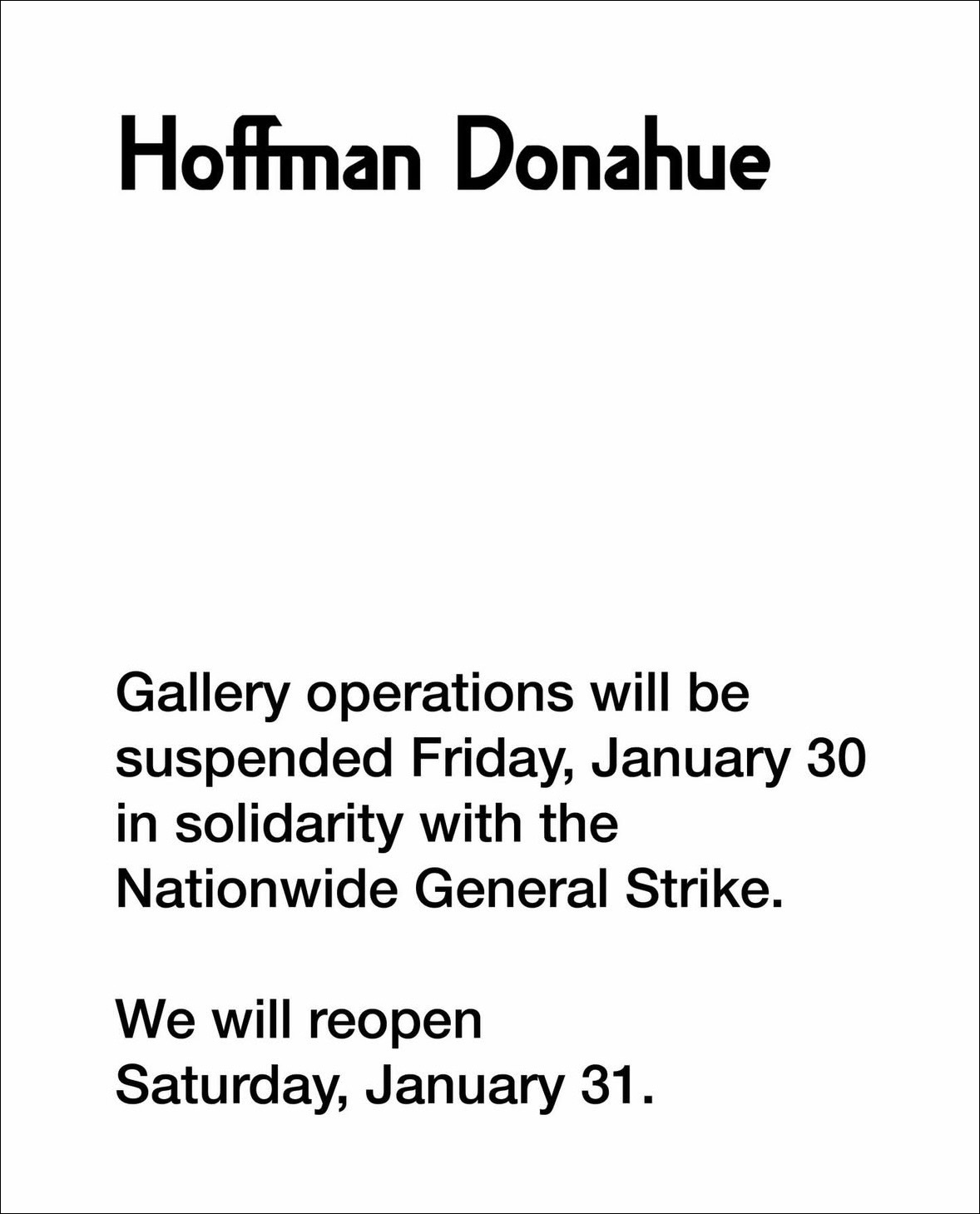
MOST LIKE A HARVARD RECOMMENDATION LETTER

For its tasteful small logo and faux paper background
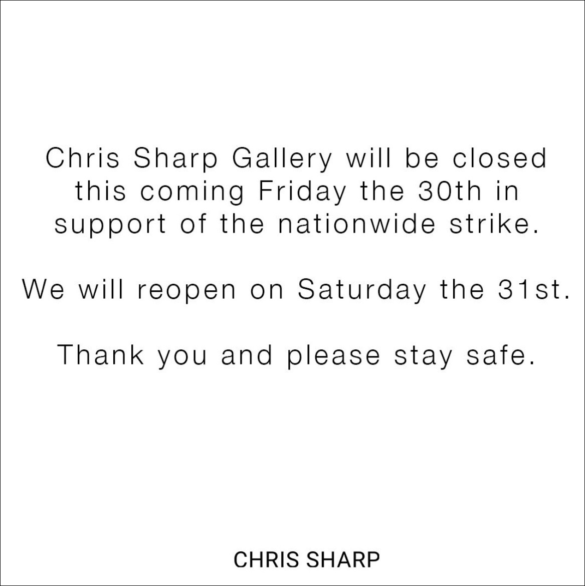
MOST UNSOPHISTICATED BECAUSE THEY CENTERED THEIR TEXT LIKE PEASANTS


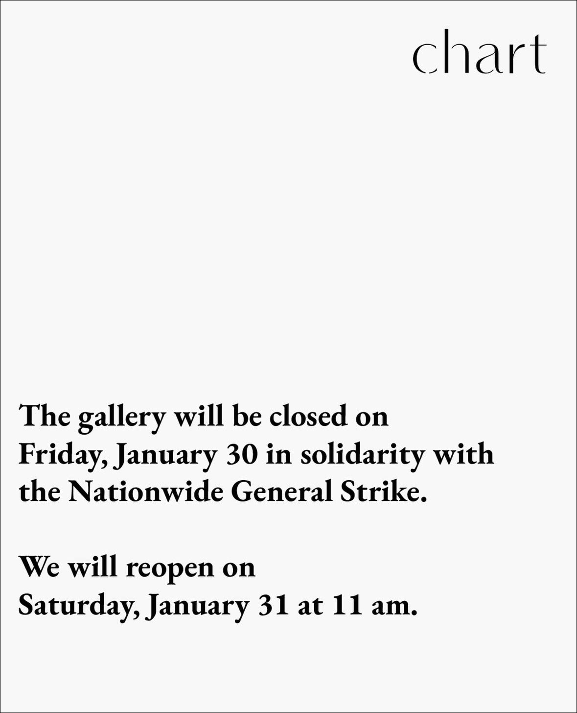
MOST TRYING TO STAND OUT WITH A CURVEBALL RIGHT-ALIGNED LOGO


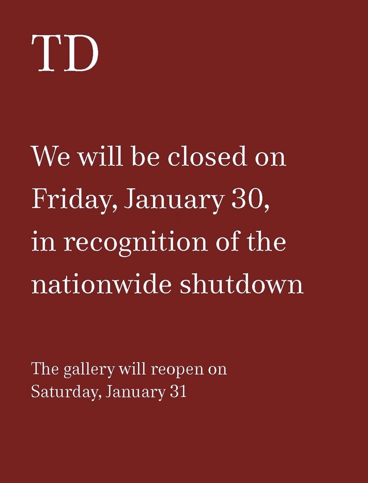
MOST TRYING TO STAND OUT WITH A CURVEBALL BOTTOM LOGO

MOST TRYING TO STAND OUT BY ALIGNING TEXT EVERY WAY POSSIBLE

MOST BLUE

This one was accompanied by “Strange Fruit” sung by Billie Holiday as its music
MOST GREEN


MOST LOOKING LIKE A BANK
MOST LOOKING LIKE THE ORIGINAL SHINING POSTER

MOST “DON’T FORGET ABOUT US NON-PROFITS!”


MOST CONFIDENT THAT THEIR FONT IS ENOUGH OF A LOGO


MOST RESPECTED BECAUSE WHY NOT TAKE YOUR SHOT

Closure notice plus an image of their current exhibition? Why didn’t anyone else think of this? What a bunch of wusses.
Jesus of Nazareth (c. 6–4 BCE – c. 30–33 CE) was a 1st-century Jewish preacher and religious leader, the central figure of Christianity, believed by Christians to be God’s Son and the Messiah, born in Bethlehem to Mary and Joseph, raised in Nazareth, who taught about God’s kingdom, performed miracles, and was crucified in Jerusalem by Romans, then resurrected, changing world history. They are currently a contributor to Filthy Dreams.